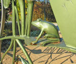
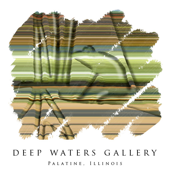
I
went to a Photoshop seminar Friday and this image is an
amalgam of the various techniques that were discussed
(plus a few I threw in for good measure). The horizontal
banding comes from selecting a narrow vertical rectangle
from the base picture, putting it on its own layer and
then expanding it to fill the frame (in CS2 I used the
single column marquee tool) The 3-D look comes from using
a blurred, black & white selection of the frog & plants
as a displacement map (Distort>Displace). I added shading
on a 50% gray layer set to overlay to emphasize the depth.
The painted look is achieved with a layer mask, first
filled with black and then brushed with a white brush
from the rough texture brush set. The spaced out lettering
is done using the type options box -- in CS2 you can scrub
the field that controls inter-letter spacing. The
font is Trajan Pro.